
TL;DR
Motivational quote wall art is a visual reminder: a printed or hand-lettered message displayed in a shared or personal space. Choose words that feel relevant to the people who see them, make the lettering easy to read, and place the piece where it can be noticed without adding clutter. It can support a mood or remind you of a goal, but it cannot replace planning, practical support, or professional care.
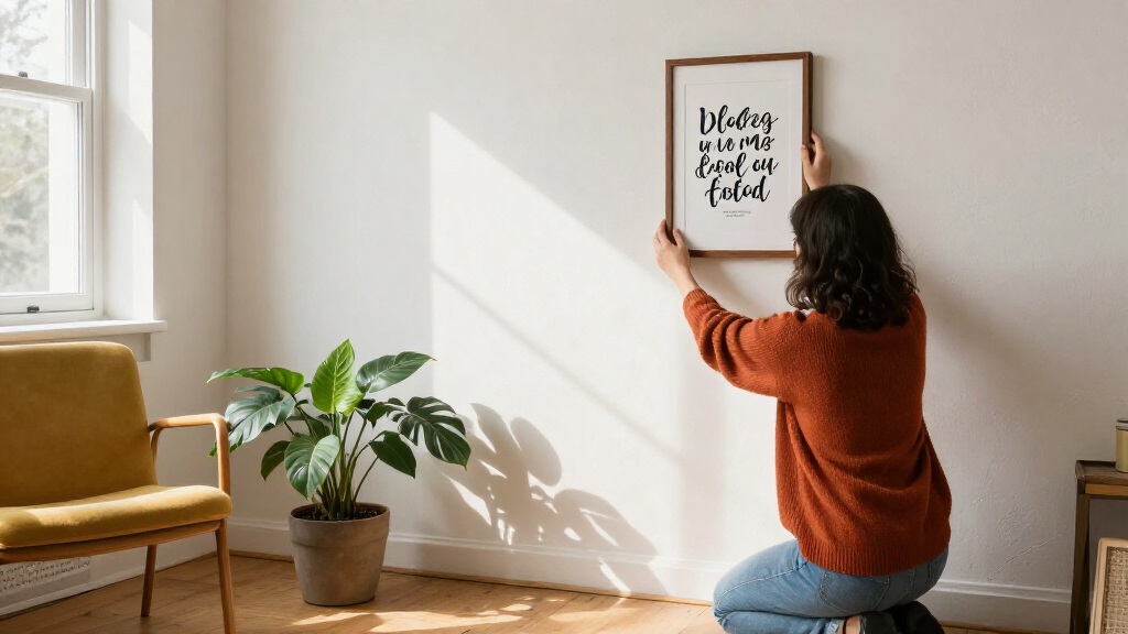
A sentence on the wall can greet you before your first cup of coffee, but the right words matter more than a dramatic font. Motivational quote wall art gives a message a visible home: above a desk, beside a gym mirror, or in the hallway you cross each morning.

Get the little things that make your day delivered free with Prime
- Fast, free delivery on millions of items
- Prime Video, Amazon Music and more included
- Member-only deals all year
This guide helps you choose a quote that feels like yours, match its style and material to the room, and place it where the words stay readable. You’ll also find practical checks for custom orders, famous attributions, and mixing quote prints with other art. Think of the piece as a small signpost, not a shortcut to a goal.
Choose wording that fits the room’s audience and feels encouraging without making rest sound like failure.
Test the intended print size with paper on the wall and read it from your usual viewing spot.
Use strong contrast, clear spacing, and simple line breaks so the message stays legible.
Match paper, framed prints, canvas, wood, or metal to the room’s light, humidity, upkeep, and mounting needs.
Treat a quote as a reminder that may cue an action, not a promise of improved mood or performance.
Choose a message that feels like yours
Motivational quote wall art works best when its message feels relevant to the people who see it and fits the room’s purpose. The words might encourage perseverance, invite a pause, or make someone laugh; a phrase that feels uplifting to one person can feel like pressure to another. That personal fit matters because a message becomes part of the room’s repeated cues. When it reflects a value you actually hold, it can feel grounding; when it conflicts with your circumstances, seeing it every day may make the space feel judgmental instead.
Picture a home office where you keep rewriting a project plan. “Keep going” might sound like a demand on a tiring day, while “One thing at a time” could help you focus on the next small task. In a family kitchen, a playful line may feel more welcoming than a solemn slogan. The audience matters: a shared space calls for words that more than one person can comfortably live with. A private room gives you more freedom to choose a phrase that speaks to a specific struggle or ambition.
Try reading your candidate phrase aloud and asking what it asks of you. Does it celebrate a value, such as patience, or imply that rest is failure? That distinction affects whether the words feel supportive over time. Gentle reminders can hold both encouragement and limits. A short original phrase may also feel more personal than a familiar saying, especially if it reflects a family habit or an inside joke; the tradeoff is that a phrase meaningful to you may need more context for guests to understand.
Before printing custom wording, check spelling and punctuation in the final preview. Small errors are especially noticeable in a short phrase because there is little else for the eye to read. If you attach a famous person’s name to a quote, verify the source; online attributions are often wrong. For a product you plan to sell, confirm rights to the wording, artwork, and fonts. Attribution alone does not grant permission, and copyright rules vary by jurisdiction.
Popular right now

Shark PowerDetect Robot Vacuum and Mop Combo with 60-Day Self-Emptying Base (AV2800ZE)

Samsung 85-Inch M80H Series 4K Mini LED Smart TV (2026)

De'Longhi Stilosa Compact Manual Espresso Machine with Manual Milk Frother
As an affiliate, we earn on qualifying purchases.
Put the words where you can actually read them
Placement and viewing distance determine whether a quote reads like a useful reminder or turns into wall decoration you barely notice. Put it near the activity it relates to, then check whether the lettering is visible from the place you will usually stand or sit. A home-office print near your desk can be smaller than a gym message meant to be read from across the room. The closer the artwork is to the moment it relates to, the more likely it is to serve as a cue; placing it too prominently, though, can make it compete with the activity itself.
For example, imagine a short phrase above a treadmill. If you can only make out the first word from the running belt, the piece may need larger letters or fewer lines. Near a desk, you might choose a subtler print at seated eye level, where its words are easy to glance at without pulling your attention away from the screen. This is a tradeoff between visibility and distraction: a message should be noticeable at a glance, not demand repeated effort to decipher or interrupt the work it is meant to support.
Use this quick sequence before you order or hang anything:
- Measure the wall and note nearby furniture, shelves, switches, or doors.
- Pick a viewing spot, such as your desk chair, kitchen doorway, or treadmill.
- Test the size by taping up paper cut to the print’s dimensions and reading it from that spot.
- Check the light at the time you’ll usually see it; glare from a window or lamp can hide lettering under glass.
A small print can make a nook feel intentional, while a broad blank wall may call for one larger piece or a group. The right scale also affects how the room feels: a tiny print on a large wall can look lost, while an oversized message can dominate a calm space. Leave breathing room around the words. Visibility should feel natural, not like the message is competing with your work or crowding the furniture.
Make the lettering clear before you choose a font
Readable typography starts with contrast, size, spacing, and line breaks; decorative lettering comes after those basics. A beautiful handwritten script can be hard to read in dim light, especially when several words curl together. For an everyday reminder, your eyes should understand the message quickly. If reading it takes effort, the design is less likely to work as a passing cue and more likely to become background decoration.
Consider two versions of the same phrase, “Make room to begin.” On a pale wall, dark, clean letters with generous spacing may stand out from several feet away. Thin cream lettering on a bright background could look delicate up close yet disappear from the doorway. High contrast is practical, and it can still suit a soft, calm palette. The design choice is not simply bold versus beautiful: contrast can come from a subtle difference in tone, but a low-contrast look trades distance legibility for a quieter appearance.
Think of the layout as a path for your eyes. A deliberate line break can give a key word room to land; an awkward break can make a phrase look like separate fragments. One or two type styles usually keep the design easy to follow. If you are considering a preview image on a product page, zoom in and inspect small punctuation, thin strokes, and the gaps between lines. A layout that works in a square thumbnail may feel crowded at its actual size, so judge the whole composition rather than the font alone.
Lighting changes the result, too. Glass over a framed print may reflect a window, while a matte finish can cut down on glare. Try viewing the mockup at the size you plan to hang, then stand across the room. If you have to lean in to read the words at the intended distance, choose simpler lettering, larger type, or a shorter quote. Each adjustment preserves a different quality: simpler letters improve speed, larger type increases presence, and shorter wording can keep the design from overwhelming a small wall.
Match the material to the room and your budget
The best material depends on where the art will hang, how much texture you want, your budget, and the care you can give it. Paper prints are light and easy to change, framed pieces have more presence, canvas adds a softer texture, and wood or metal signs bring a sturdier surface. None works everywhere; humidity, direct sunlight, and mounting needs can change the choice. A material that looks right on a product page may be inconvenient once you consider how it will age, clean, or move with the room.
For a rental home office, a lightweight print in a frame may be easy to move when the desk changes sides. In a busy entryway, a more durable surface might better suit a spot where bags brush the wall. In a steamy bathroom, paper may need protection and careful placement away from moisture. Room conditions matter as much as appearance. For example, glass can protect a print from dust but add glare, while an unframed canvas avoids reflections but may be harder to clean thoroughly.
Digital downloads let you choose local paper, frame, and dimensions, but you take on the printing decisions. Check the file’s resolution for your intended size and compare the print dimensions with your wall before sending it to a shop. A small image enlarged too far can look soft, like a blurry sign glimpsed through rain. The flexibility can save on shipping and let you choose a finish locally, but it also means you are responsible for color differences, trimming, and finding a suitable frame.
Made-to-order work gives you more control over color, wording, and size. Before buying, confirm what comes with the order: frame, mat, mounting hardware, or just the print. Also review cleaning instructions, sunlight exposure, shipping or download terms, and the return policy. A clear preview and careful measurements help prevent a lovely design from arriving too tiny for its wall. A lower upfront price may involve extra costs for framing or printing, so compare the completed setup rather than the listing price alone.
Build a gallery wall without burying the quote
A quote print can sit comfortably beside other art when the group shares a visual thread and gives the words enough room. Repeat a frame finish, a color, or a subject across the display, then vary the sizes to keep the arrangement lively. The quote should remain legible rather than becoming one more crowded patch of text. A shared visual detail helps varied pieces feel related, while leaving room around the quote protects the reason you chose it in the first place.
For example, above a reading chair you could pair a small quote with a landscape photograph and a simple botanical print. Repeating warm wood frames ties the pieces together, while the different images keep the wall from looking like a row of matching signs. In a home office, photos or sketches can soften a cluster of goal-focused messages. That balance matters because several slogans can make a room feel like a set of instructions; a photograph or personal object gives the eye a place to rest and makes the arrangement feel lived in.
Use paper cutouts to plan the arrangement before putting nails in the wall. Shift the shapes until the gaps feel even and the overall group relates to the furniture below it. One clear focal point helps: make the quote the largest piece if its words are the main attraction, or keep it smaller when a photograph should lead. A focal point gives the display a reading order; without one, the eye may bounce between pieces and the quote can lose its impact.
Some people make a motivational quote wall from several messages; others mix one print with photographs or objects gathered on a trip. A gallery wall can include art displays brief in wording or uplifting or goal-focused messages in a shared space, but no arrangement needs to carry every idea at once. Leave a strip of open wall around the grouping. That quiet edge makes the display feel more like a thoughtful collection than a bulletin board, and gives the messages visual separation so they remain readable.
Use the artwork as a reminder, not a promise
Motivational wall art can serve as a visual cue for a value or goal, but its effect varies from person to person. A print cannot promise better productivity, a brighter mood, or lasting change. It may remind you of an intention when you pass it, much like a note on the fridge, while the actual work still depends on your choices, circumstances, and available support. The distinction matters because expecting a decorative object to solve a practical problem can leave you disappointed or make a hard situation feel like a personal failure.
Imagine you want to stretch during a long workday. A small “Pause and reset” print beside your monitor might prompt you to stand up when you notice it. But if meetings run back to back, the words alone cannot create a break. Pairing a reminder with a practical plan, such as adding a short calendar block, makes the intention easier to act on. The print can help make the plan visible; the calendar block addresses the time constraint that the message itself cannot change.
That distinction also helps you choose a kinder message. “Rest is part of the work” may suit a room where someone feels pressure to keep producing. A fitness space might call for a phrase about steady effort, but the same line could land poorly for someone recovering from illness or injury. Context shapes how a message feels, so choose words with the room’s occupants in mind. Even a well-meant phrase can carry different implications depending on someone’s health, workload, or current responsibilities.
A good wall quote can point you toward a value. It cannot do the choosing or the work for you.
If a piece starts to feel irritating, take it down or move it. Decor is allowed to change as your routines and priorities change. Keep the reminder useful, and let the blank wall return when that is what the room needs. Removing it is not a failure to live up to the message; it is a way to make the room fit the people using it now.
Frequently Asked Questions
What makes motivational quote wall art effective?
A piece is more likely to feel useful when its message matters to the people who see it, is easy to read, and suits its setting. A short phrase near a desk may be a quiet cue, while a message in a gym needs to read clearly from farther away. Its effect varies, and it cannot guarantee a change in mood or behavior.
Where should I hang a quote print?
Choose a spot where you will naturally see it without crowding the room or competing with a task. A home-office reminder might sit near your desk at seated eye level; a gym phrase may need a more visible position across the room. Check glare and lighting from the place you expect to read it.
How do I choose the right size?
Measure the wall, account for furniture and nearby art, and consider how far away you will read the words. Tape up paper cut to the planned dimensions and test it from your usual spot. A small print can suit a nook, while a broad wall may need a larger piece or a thoughtfully spaced group.
Which material should I choose?
It depends on your budget, the room, and how much upkeep you want. Paper prints are light and easy to replace; framed prints add structure; canvas brings texture; and wood or metal gives a different, often sturdier feel. Consider humidity, direct sunlight, cleaning, and mounting before deciding.
Can I sell a product with a famous quote on it?
Check the quote’s wording, source, copyright status, and any licensing requirements that apply where you sell. Rules vary by jurisdiction, and adding the speaker’s name does not grant you permission. Verify the rights to the artwork and fonts as well; an original phrase can avoid attribution errors.
Conclusion
Choose one message you actually want to see, then size and place it so you can read it in the room’s everyday light. Check the wording, material, and mounting details before you buy; the small practical choices are what help a meaningful phrase feel at home.
Let the art be a signpost, not the whole journey. A few clear words on the wall can meet you like morning light across a desk: there when you need a reminder, quiet when you don’t.